

friEdTech Rebrand
// Project Overview
In 2022, I had the opportunity to lead the rebranding efforts for friEdTech, an instructional technology professional development company based in Houston, TX. The company needed a fresh brand identity that not only reflected its playful and educational roots but also positioned it as a sophisticated partner for major industry players like Google, Adobe, and Microsoft.

// My Role
As the lead designer, I was responsible for the entire rebranding process, from initial concept sketches to final design approval. My role involved close collaboration with the friEdTech leadership team, managing feedback loops, and ensuring that the final design met all of the project’s objectives.
// The Problem
friEdTech’s original branding had become outdated and was increasingly difficult to work with, especially in terms of scalability. The long, horizontal logo was challenging to fit onto various mediums, such as t-shirts and signage, without compromising its visibility or impact. Moreover, the old logo didn’t resonate with the educational technology space; it felt more like a mix of kaleidoscope visuals and typewriter aesthetics. The challenge was to create a new logo that maintained the spirit of the original brand—rooted in the CEO’s phrase “everything is better fried”—while making it versatile, modern, and relevant to the edtech industry.

// The Approach
Given my experience working with friEdTech, I had an in-depth understanding of what the leadership valued in their brand. The first step was to retain the beloved elements of the old logo, particularly the color scheme, while finding a new way to incorporate the "better fried" concept into the branding. I began the process with extensive sketching and mockups, iterating through multiple rounds of revisions based on feedback from the leadership team. Collaboration was key, as I worked closely with the team to ensure the final design aligned with their vision and could stand the test of time.


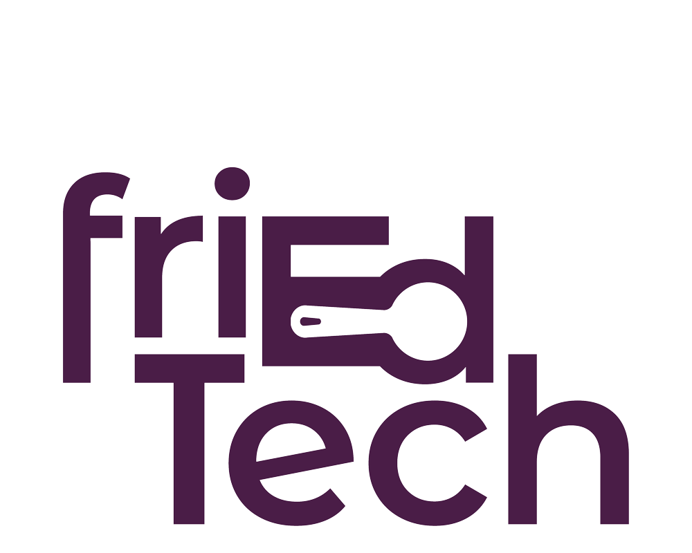
// The Solution
The final design is a versatile logo that cleverly incorporates a hidden frying pan, emphasizing the “Ed” in friEdTech. This design solution maintains the original color palette, ensuring continuity with the previous branding while offering flexibility in use. The logo comes in both square and horizontal formats, addressing the previous issue of scalability and making it adaptable for various applications, from conference banners to small icons and merchandise. The new logo not only meets the aesthetic needs of the brand but also functions effectively across multiple platforms and materials.

// The Impact
The rebrand successfully positioned friEdTech as a modern and sophisticated player in the edtech space, while still retaining its unique, playful identity. The new logo has been well-received, translating seamlessly across different mediums and enhancing the company’s visibility at conferences and in digital spaces.

